Short on time? This clip is all you need.
Zuge Electric
Two seconds, eyes down.
Zuge makes electric scooters for delivery drivers in Bengaluru, India. Drivers run 30+ orders a day. I designed the dashboard as a design consultant at Sharp.
- Team
- 1 Product Lead2 Senior UX3 stakeholdersme
- Duration
- 2023 – 2024redesign in 2026
- Platform
- 7-inch TFT touchscreen
- Live
- zugeelectric.com
Principle
AI suggests.
The driver decides.
Nothing is accepted, rerouted, or batched without the driver’s confirmation.
The Outcome
Less looking down, more driving.
0%
Less phone use on the road
0%
Faster task completion
0M+
Gig drivers on the platform
The Problem
Every driver was doing this job with a phone taped to the handlebar.
Across 20+ ride-alongs, the same patterns kept surfacing. None of them were about taste. All of them were about safety.
Checked their phone 5+ times per delivery.
Had a near-miss from a glance down at speed.
Felt range anxiety in the middle of a shift.
Wanted a built-in display over a taped-on phone.
2026
Built AI native, so the dashboard thinks before the driver has to.
I designed Zuge in 2023, before AI could run on a dashboard. So I asked: how would I build it now? I kept the color-coded riding modes and added three things.
Safety
Speed-first screen
Less on screen when moving, more when parked. Touch turns off while riding.
Voice
Mitra, a voice guide
Drivers talk to it in English or 8 Indian languages, hands on the handlebars.
Orders
Spill-aware orders
It flags liquid orders at accept, gives a tip at pickup, and alerts the driver before speed breakers.
Modes
Riding modes
Drive, Power, and Eco, each with its own colour. The driver reads the state before reading a single number.
Light
Day and night
A bright map that holds up in direct sun, fully dark after sunset so nothing glares. The light sensor switches it, not the driver.
Battery
Low battery, handled early
Mitra counts the battery in orders left, not percent: two. It finds a fast charger already on the route, and says when 80% is enough to finish the shift.
Weather
Weather warnings
A brief before the shift, a raincoat stop on the way, a reroute around flooding, and the customer told before they ask.
Before Screens
the overlays, as components
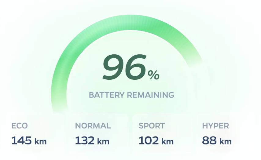
Battery & range
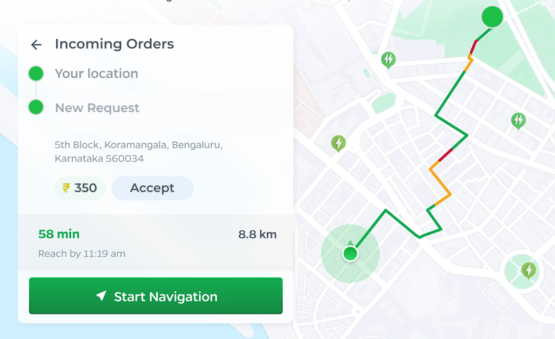
Incoming order
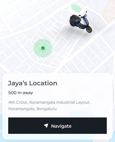
Driver location
the dashboard, across states
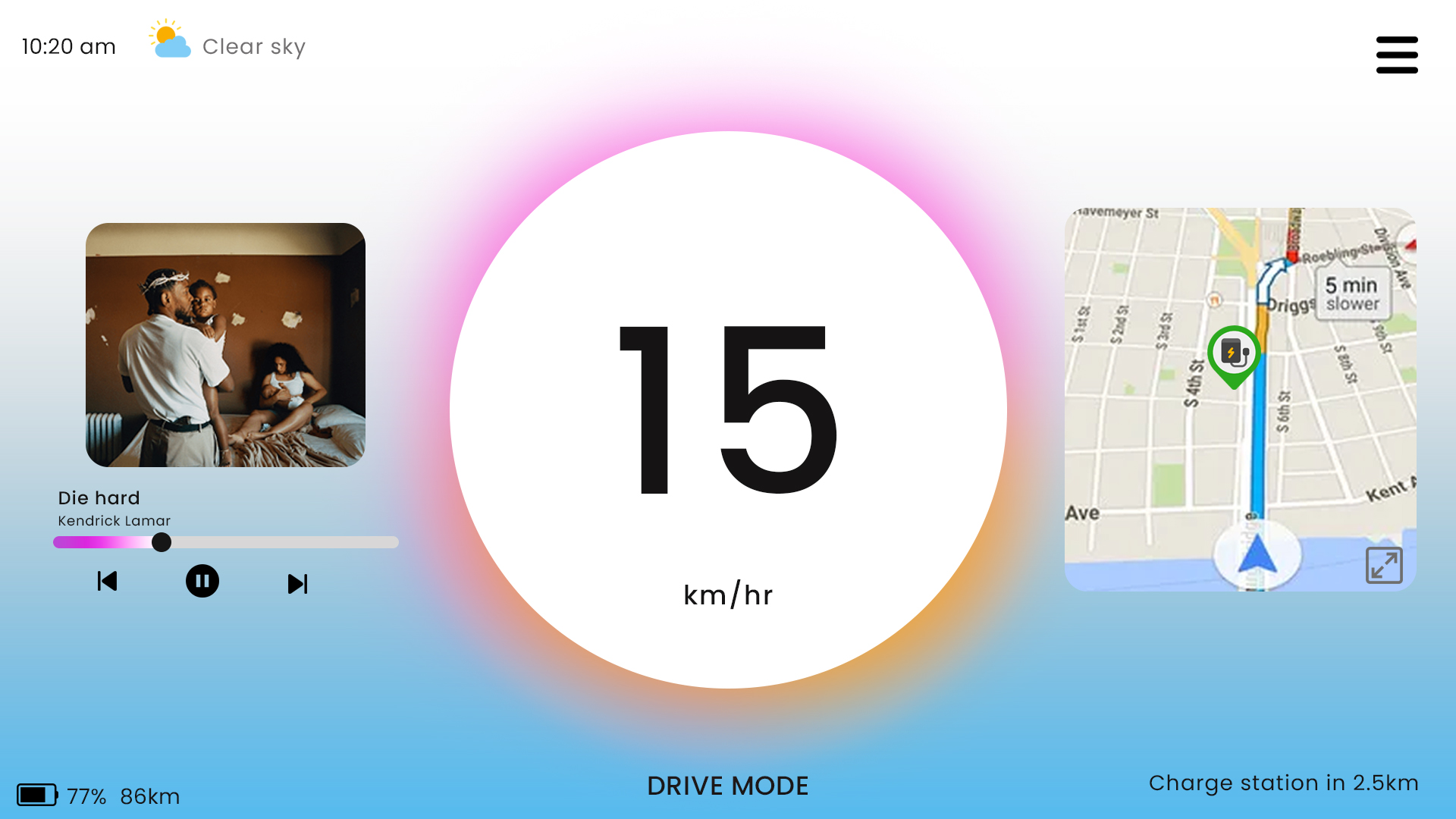
On the road: speed, nav & music
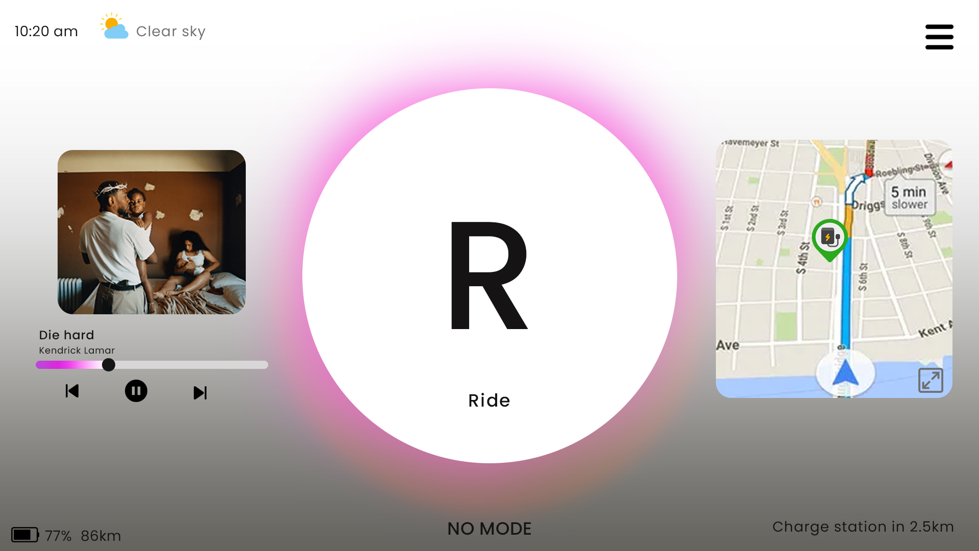
Ride mode
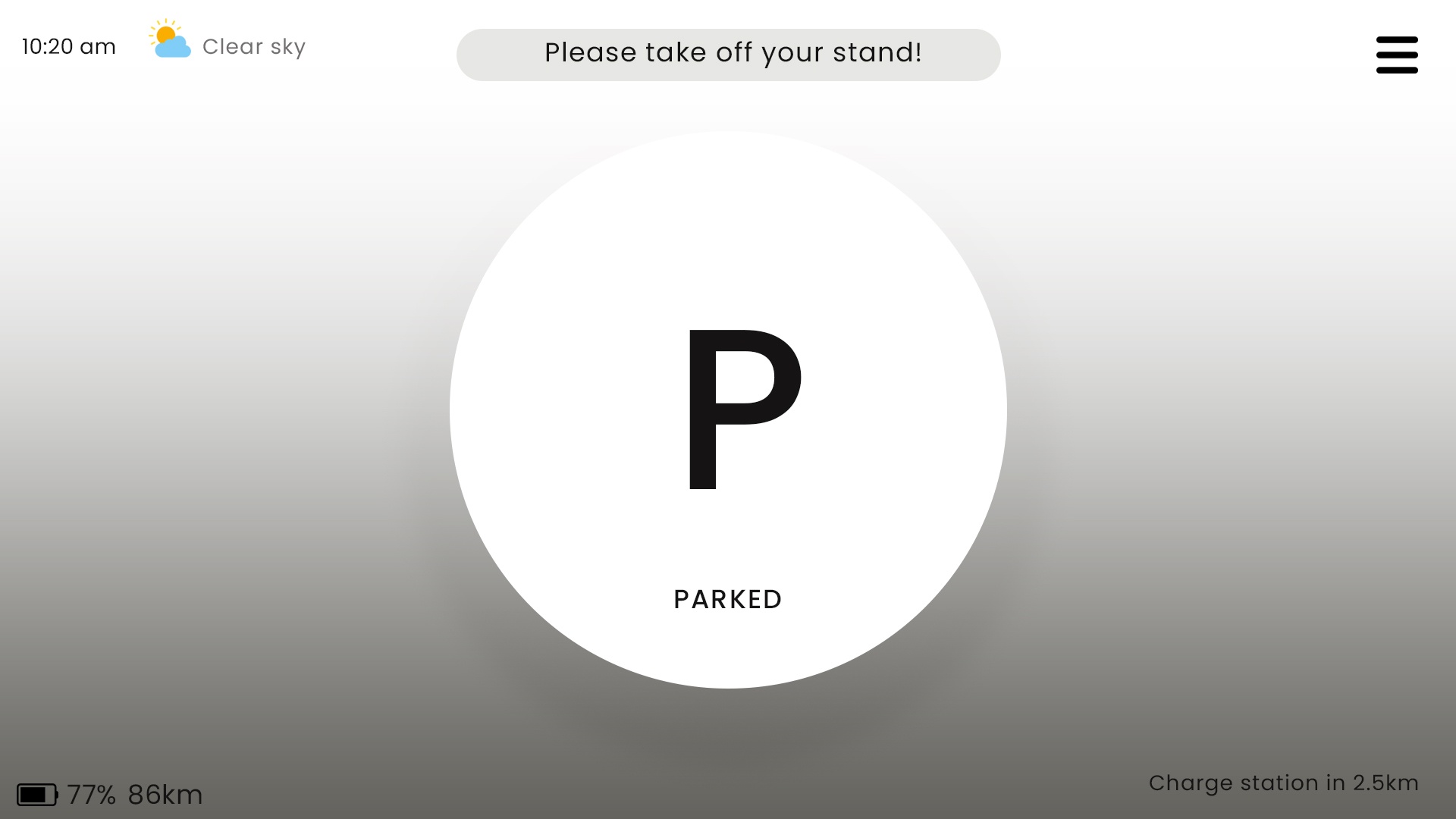
Parked
In Context
Final screens, on the bike.
Rendered on the real chassis, across the colourways drivers actually buy. The hierarchy that held up at a desk had to hold up here too: at a glance, in sun, mid-shift.
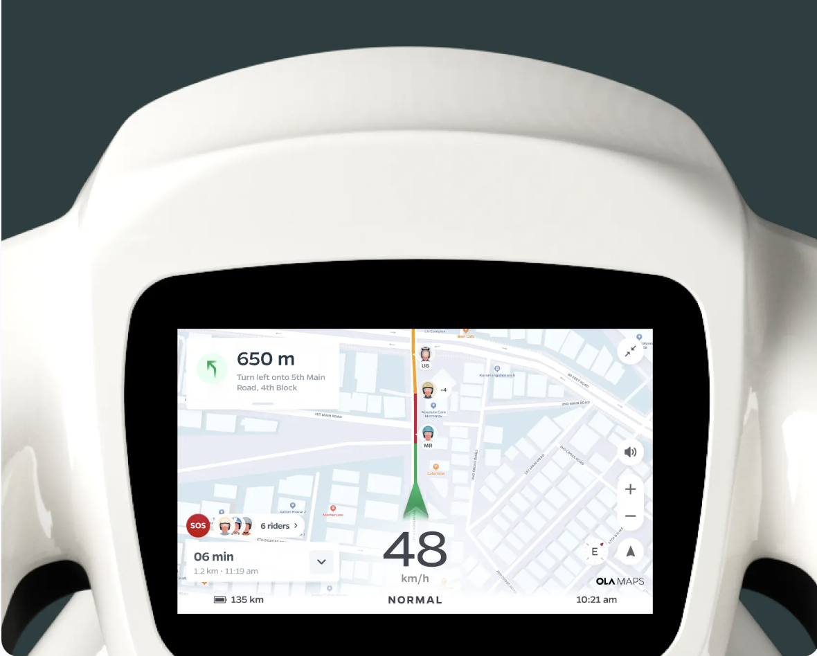
Turn-by-turn at 48 km/h
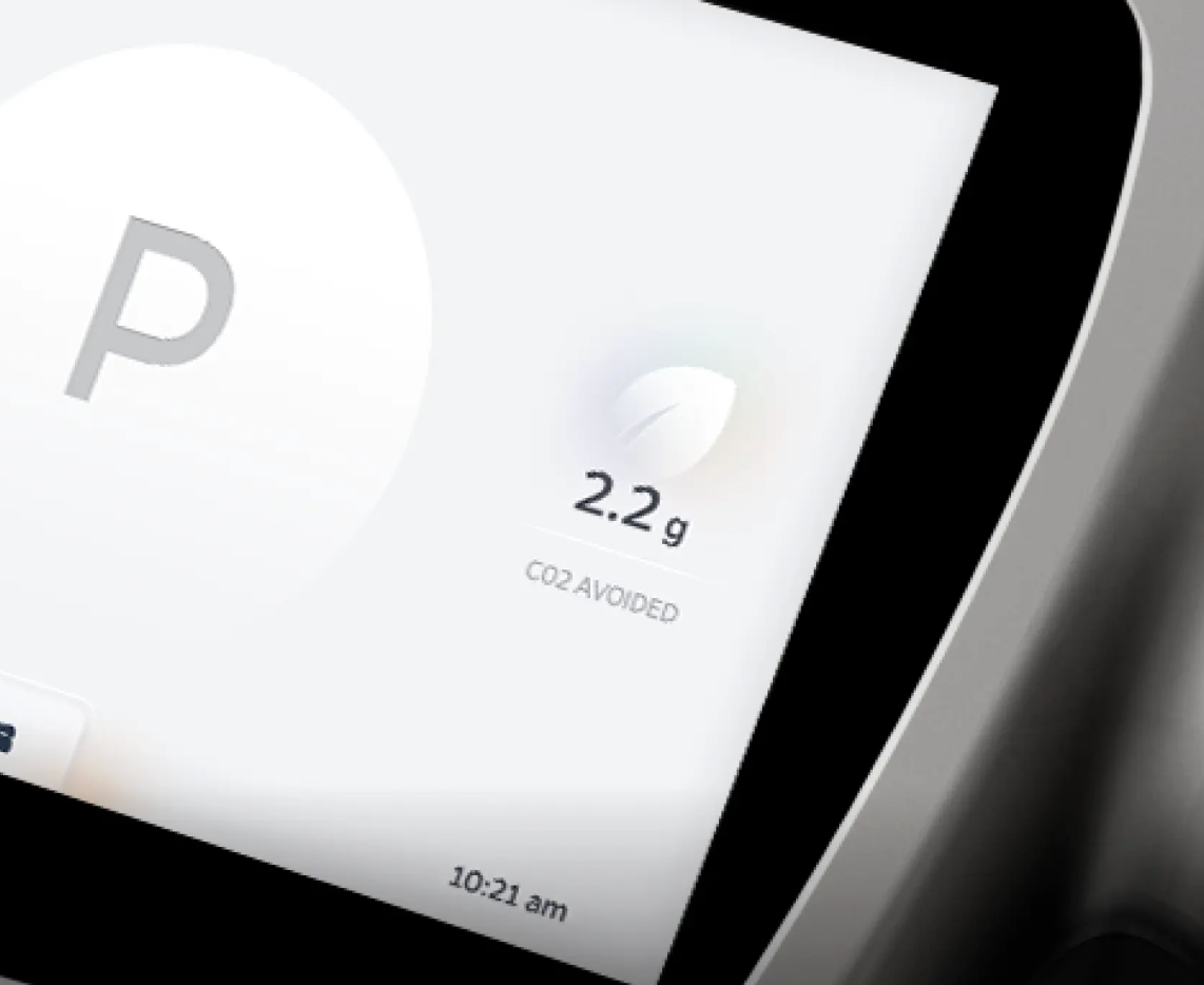
Parked · CO₂ avoided
wanna see more?
I’m happy to chat more about my process over a call. Reach out to me at shrutybrahmananda@gmail.com